


Graphics Design


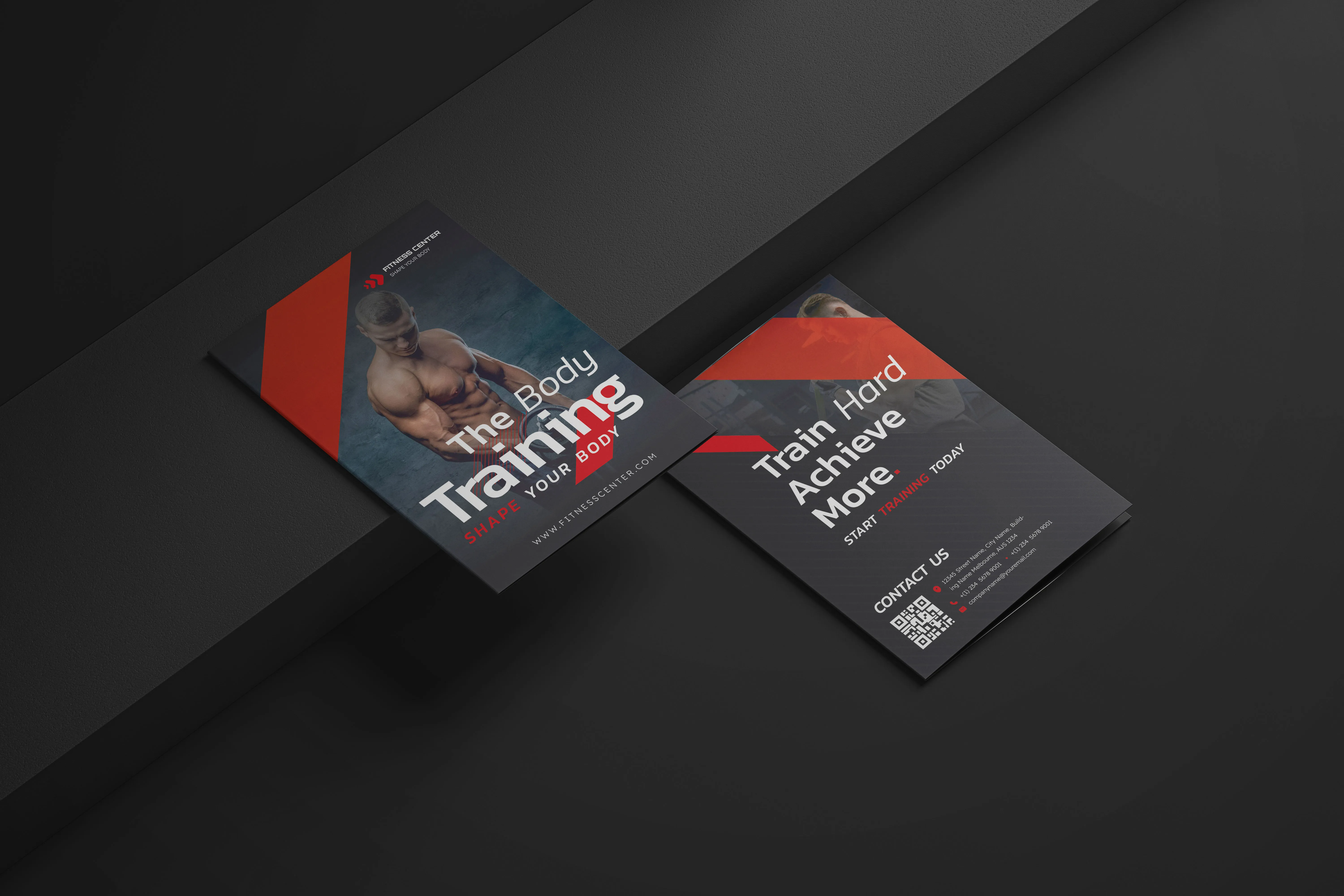
This brochure presents a fitness brand built on consistency and results in a clear, uncomplicated method. Instead of relying on loud visuals or exaggerated messaging, the design focuses on delivering information with clarity, balance, and intent, allowing the content to speak with confidence and purpose.
The overall direction was shaped around how real users read, scan, and absorb information. Each section was arranged to support quick understanding while still maintaining a strong visual presence. The result is a layout that feels controlled, professional, and aligned with the mindset of individuals who value structure, discipline, and progress in their training journey.
From the cover to the inner spreads, the design follows a strong visual hierarchy that guides the reader naturally through the content. Headlines are bold and direct, while supporting text remains concise and readable, ensuring key messages are communicated without overwhelming the reader.
Imagery plays a supporting role rather than dominating the layout. The visuals reflect real effort, focus, and physical commitment, reinforcing the serious tone of the brand. Typography, spacing, and alignment were handled with precision to maintain a clean, structured, and easy-to-navigate brochure.
Overall, this project represents a disciplined and thoughtful design solution that communicates strength and professionalism without unnecessary complexity. It presents the fitness centre as a space defined by focus, clarity, and consistent performance.
Receive updates, insights, and useful tech information directly in your email.