


UI/UX Design


This project took shape as an exercise in designing with empathy, where understanding parents’ concerns and children’s emotional needs became the foundation of every design decision. Rather than relying on familiar layouts, the experience was thoughtfully crafted to feel reassuring, structured, and naturally engaging from the very first interaction.
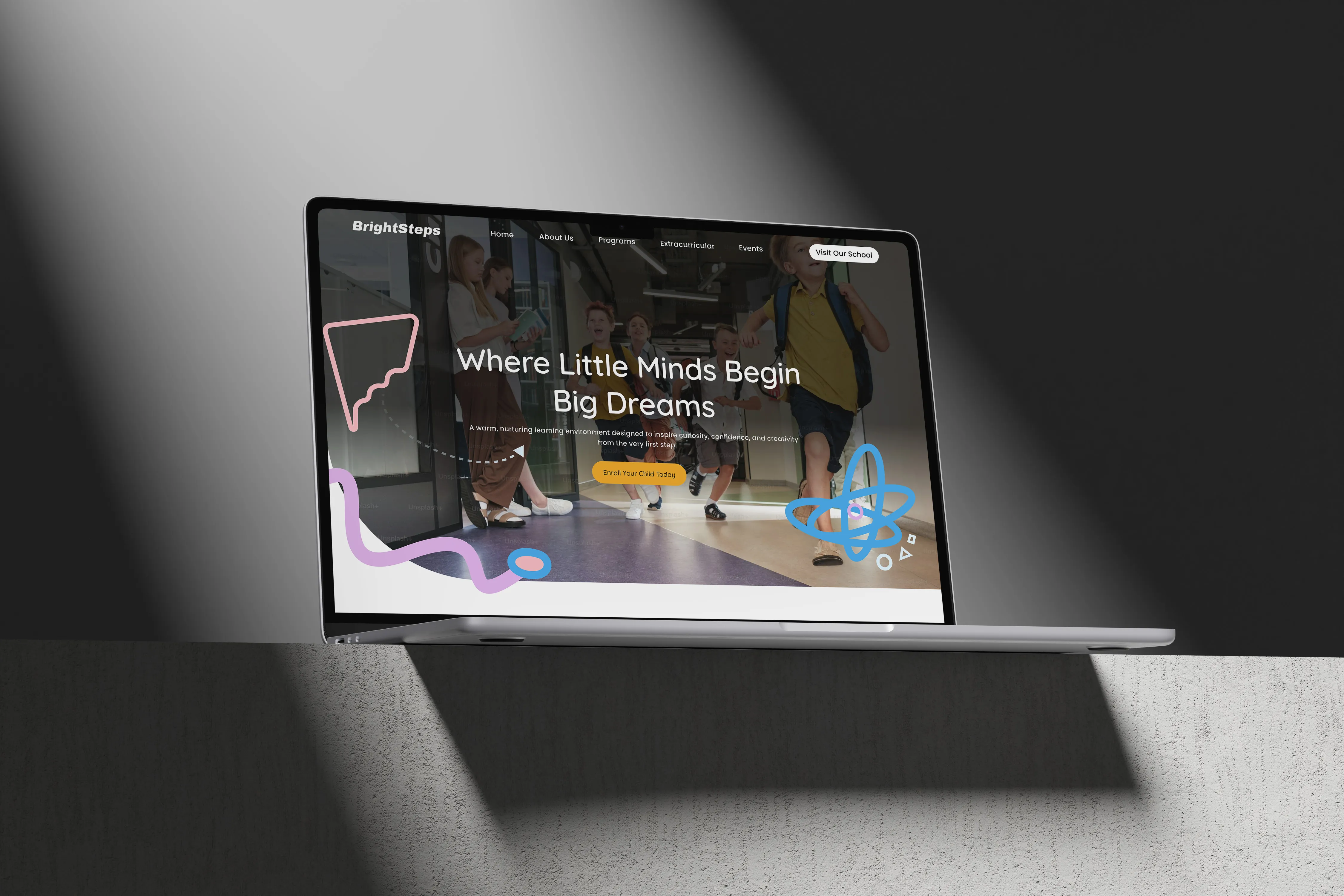
The digital interface was carefully shaped to mirror the warmth, safety, and encouragement found in an early learning environment. Soft visual elements, friendly typography, and balanced colour tones were selected to create a calm and positive first impression, while still maintaining a professional and trustworthy presence for parents. Every design choice supports clarity, helping users absorb information without cognitive overload.
A strong focus was placed on information architecture to ensure content is organized logically and intuitively. Program details, activities, and school values are presented in a way that feels guided rather than complex. Clear sectioning and thoughtful spacing allow users to move comfortably through the platform, reinforcing a sense of confidence and ease while exploring.
Usability played a key role throughout the process. Navigation patterns were designed to feel natural, minimizing effort and allowing parents to quickly find what matters most. Interactive elements were intentionally subtle, ensuring engagement without distraction, especially important in an environment that represents young learners and educational trust.
This project represents a meaningful milestone for our team, showcasing our ability to translate emotional intent into functional digital design. It reflects our growing maturity in creating experiences that are not only visually pleasing but also purposeful, human-centred, and aligned with real-world user expectations.
Receive updates, insights, and useful tech information directly in your email.